8 Chart Patterns Every Trader Must Know for Profitable Trading
Introduction
Charts are the backbone of every trader, it doesn’t matter what instrument or commodity you trade in, be it, cryptocurrencies, gold, crude oil, currency pairs, stock, etc. The importance of price charts cannot be overemphasized. This is especially true for traders who use technical analysis when speculating on future price movements or analyzing the market. Just in case you are wondering why they are soo important, it is because they show historical price movements, patterns, and activities that have occurred in the market and are very likely to reoccur in the future.
Therefore, being able to read a chart and identify chart patterns is a very important aspect of trading, and although it might look a little bit complex or even complicated as you try to identify these chart patterns, just like any other craft, as you take time to consistently lookout for them and identify them while carrying out your technical analysis, it becomes a lot easier and improves your ability as a trader.
In this article, I will be giving you the eight (8) most important and effective chart patterns you can find, I will be explaining how they can be identified, and finally, I will give examples of how you can use these chart patterns to make profitable trades. As I said earlier, it doesn’t matter what commodity or asset you trade in, these patterns can be identified in any price trading chart.
Before we proceed as usual, let’s get to understand what chart patterns are, since we already know how useful they can be in our trading.
Meaning of Chart Patterns
Chart patterns can be defined as visual formations that occur on price charts while carrying out technical analysis which is a method used to predict future price movements in financial markets. These patterns are created by the price movements of an asset, such as stocks, currencies, or commodities, over a specific period of time, ranging from minutes to hours to days, weeks, and months.
Chart patterns can be classified into two forms namely: reversal patterns or continuation patterns. Reversal patterns indicate a potential change in the trend of the asset’s price, while continuation patterns suggest that the existing trend is likely to continue. These patterns are formed by a combination of price highs, lows, and the timing of those price movements. Traders and analysts study these patterns to gain insights into the market sentiment and make informed trading decisions.
It is important to note that, understanding and identifying chart patterns while carrying out your technical analysis, does not guarantee that your trade would go in the predicted or speculated direction, that the patterns might be pointing towards. Therefore, you need to also apply other strategies to get a confluence and much more solid confirmation before taking your trade. This will help reduce/minimize your losses and improve your profit chances.
Next, we will be looking at some of the basic chart patterns that you are very likely to come across as you continue your trading journey.
See Also: Supply and Demand Zones: A Profitable Trading Strategy
8 Common Chart Patterns Used in Trading
- Head and Shoulder Pattern
- Inverse Head and Shoulder Pattern
- Double Top Pattern
- Double Bottom Pattern
- Ascending Triangle
- Descending Triangle
- Bullish and Bearish Pennant
- Cup and Handles
Head and Shoulder Pattern:
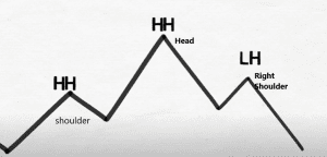
The head and shoulders chart pattern is one of the most popular reversal chart patterns observed in technical analysis. It is named thus because of its resemblance to a head with two shoulders. This chart pattern is typically formed at the end of an uptrend and signals a potential trend reversal from bullish to bearish.
The head and shoulders pattern consists of three peaks, with the middle peak being the highest (the head), and the two surrounding peaks on either side being slightly lower (the shoulders). These peaks are connected by a trendline called the neckline, which is drawn by connecting the lows between the peaks.
The pattern is considered complete when the price breaks below the neckline after the formation of the right shoulder. This breakdown is often accompanied by an increase in trading volume, signaling the confirmation of the pattern. Traders typically look for a close below the neckline to validate the pattern.
The head and shoulders pattern is considered a bearish reversal signal.
When the head and shoulders pattern is confirmed, it suggests that the previous uptrend is losing momentum, and a potential trend reversal to the downside may occur. Traders often interpret this pattern as a shift in market sentiment, with sellers gaining control and buyers losing strength.
The target for the bearish reversal is estimated by measuring the distance from the neckline to the top of the head and projecting it downwards from the breakdown point. This projected distance gives an approximate target for the potential decline in price.
It’s important to note that not all head and shoulders patterns lead to significant trend reversals. Traders should consider other technical indicators, such as momentum oscillators and volume analysis, to confirm the pattern’s validity and increase the probability of a successful trade.
Inverse Head and Shoulder Pattern:
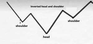
The Inverse Head and Shoulder Pattern is a variation of the main head and shoulders pattern. For the inverse head and shoulder pattern, the pattern forms at the end of a downtrend and indicates a potential bullish reversal. This variation is essentially a mirror image of the classic head and shoulders pattern.
The inverse head and shoulder pattern is the direct opposite of the typical/regular head and shoulder pattern. It is found or formed in a downtrend market or chart and in most cases indicates the likely end of the bearish movement and a possible bullish reversal.
Traders often use the head and shoulders pattern as part of their technical analysis toolbox to identify potential trend reversals and make informed trading decisions. However, it’s essential to remember that no pattern or indicator guarantees future price movements, and it’s always prudent to combine chart patterns with other analysis techniques and risk management strategies when making trading decisions.
Double Tops Chart Pattern:
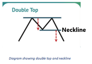
The double tops chart pattern is another technical analysis pattern commonly observed by traders in the financial markets. It often occurs when the price of an asset reaches a specific level, pulls back, and then rallies again to the same level, forming two peaks that are similar in height. The pattern resembles the letter “M” when plotted on a chart.
Here are some key characteristics and implications of the double tops pattern:
- Formation: The pattern starts with an upward price movement, followed by a temporary reversal or consolidation, and then a second rally that fails to break above the previous peak. The two peaks should be relatively close in price and have a well-defined resistance level between them.
- Resistance level: The line connecting the two peaks, or the line/zone in which the price was unable to break through after the second attempt represents a significant resistance level. This level acts as a psychological barrier for further upward movement, indicating that buyers are struggling to push the price higher.
- Reversal signal: The completion of the double-tops pattern is considered a bearish reversal signal. It suggests that the upward trend has exhausted its momentum and may reverse. Traders often interpret it as a sign to sell or take profits on long positions.
- Confirmation: Traders typically wait for a confirmation of the pattern before taking action. This confirmation occurs when the price breaks below the neckline of the double tops patterns as shown in the diagram above, the neckline is usually located at the bottom of the trough formed between the two peaks. The break below support validates the pattern and further strengthens the bearish signal.
Double Bottom Chart Pattern:
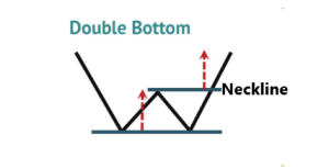
The double bottom chart pattern is the direct opposite of the double tops pattern and is a commonly observed technical analysis pattern also used by experienced traders in the financial markets. It typically occurs when the price of an asset gets to a particular level, bounces off that level, pulls back, and then rallies again to the same level, forming two troughs that have similar depths. The pattern resembles the letter “W” when identified on a chart as shown in the diagram above.
Here are some key characteristics of the double bottom pattern:
- Formation: The pattern begins with a downward price movement, followed by a temporary bounce, pullback, or consolidation, and then a second decline that fails to break below the previous trough. The two troughs should be relatively close in price and have a well-defined support level between them.
- Support level: The line connecting the two troughs represents a significant support level. This level acts as a psychological barrier for further downward movement, indicating that sellers are struggling to push the price lower.
- Reversal signal: The completion of the double bottom pattern is considered a bullish reversal signal. It suggests that the downward trend has exhausted its momentum and may reverse. Traders often interpret it as a sign to buy or enter long positions.
- Confirmation: Traders usually wait for confirmation of the pattern before taking action. This confirmation occurs when the price breaks above the resistance level, which is always called the neckline and is typically located at the top of the peak formed between the two troughs. The break above the resistance validates the pattern and further strengthens the bullish signal.
Ascending Triangle Chart Pattern:
Triangles as chart patterns can also be referred to as currency wedges, they appear when currency pairs start ranging and prices start getting closer together. Once the pattern is broken, it can be a sign to buy or sell. There are 2 types of the triangle chart patterns and they are the ascending triangle and the descending triangle. Let’s look at the ascending triangle first.
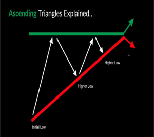
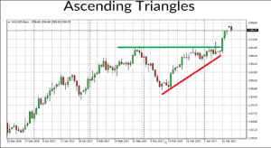
Although the price movement may be ranging it still moves towards a particular direction and that determines what type of triangle it is. The Ascending triangle, for example, shows an upward incline in the price movement. This pattern is characterized by initial low points followed by higher lows as the market advances. Eventually, there is a breakout from the triangle, typically resulting in a bullish trend, although occasional bearish movements may occur.
The Ascending triangle combines both horizontal resistance and diagonal support. During this formation, the bullish forces become stronger, preventing the market from reaching lower lows, while the bears attempt to defend an established resistance level.
In this scenario, the bulls display more aggression than the bears, as seen in the formation of higher lows. In most cases, there is a higher probability of an upside breakout due to the growing bullish momentum. However, it is always wise to wait for confirmation before drawing any conclusions (W4C).
Descending Triangle Chart Pattern:
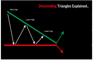
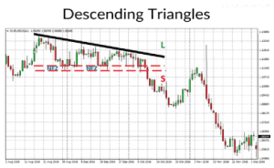
When it comes to the Descending triangle, the price movement takes a downward trajectory. This is evident as the market experiences initial high points followed by lower high levels as it progresses. Eventually, a breakout occurs, typically leading to a bearish trend, although occasional bullish movements may occur on rare occasions.
The Descending triangle also combines horizontal support and diagonal resistance. During this pattern, the bears gain strength, indicated by their selling activities at lower levels, while the bulls attempt to protect the market through the support zone. The bears’ aggressiveness is apparent in the formation of lower high levels. Consequently, a downside breakout is more likely to occur. However, it is customary to exercise caution and await confirmation before drawing any conclusions (W4C).
Bullish and Bearish Pennant:
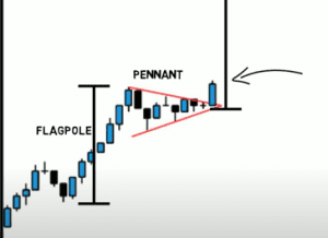
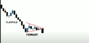
A Pennant chart pattern belongs to the category of continuation chart patterns, it is formed when there is an upward or downward movement in price of an asset, followed by a brief consolidation, before continuing to move in the same direction. This chart pattern is similar to a small symmetrical triangle called a Pennant and is made up of numerous candlesticks.
Some Basic Characteristics of the Pennant Chart Pattern:
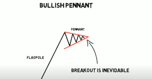
The Pennant: The core component of the pennant pattern is the pennant itself. It is a triangular pattern that emerges during the market consolidation phase, positioned between the flagpole and the subsequent breakout. The triangle is formed by the convergence of two trendlines, creating what is known as the pennant.
The Flagpole: A flagpole serves as the starting point for a pennant pattern, distinguishing it from other pattern types such as the symmetrical triangle. The flagpole represents the initial strong move that precedes the formation of the symmetrical triangle.
The Breakout: Within the pennant pattern, there are two breakout levels. The first breakout occurs at the end of the flagpole, while the second breakout takes place after a consolidation period, leading to the continuation of the upward or downward trend.
Depending on the direction of the movement, Pennant patterns are usually described as being bearish or bullish. We would be examining both chart patterns, let’s start with the Bullish pennant.
Bullish Pennant:
Bullish pennants are candlestick patterns that indicate a continuation of a strong uptrend. This pattern consists of an upward flagpole, followed by a period of consolidation, and then the resumption of the uptrend after a breakout. Traders actively observe the break above the pennant as it signals a renewed bullish momentum, providing an opportunity to capitalize on the upward trend.
Bearish Pennant:
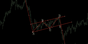
Bearish pennants chart patterns are the inverse of bullish pennants and serve as continuation patterns within strong downtrends. These patterns typically commence with a flagpole, representing a significant downward price drop, which is followed by a temporary pause in the downward movement.
This momentary pause creates a triangular formation referred to as a pennant. Subsequently, a breakout from the pennant occurs, and the downward trend resumes. Traders keenly observe this pattern and consider entering short trades upon a confirmed break below the pennant.
Cup and Handles Chart Pattern:
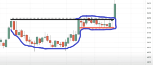
The Cup and Handle chart pattern is a bullish continuation chart pattern that signifies a period of consolidation followed by a breakout.
The cup formation takes place after a downtrend and is succeeded by an uptrend, resembling a bowl or rounding bottom shape. Upon completion of the cup, the price enters a sideways trading phase, establishing a range on the right side, which forms the handle.
A breakout from the trading range of the handle indicates a continuation of the previous uptrend. Ideally, the cup should exhibit equal highs on both sides, although in reality, perfection is rare, much like finding an ideal life partner. Following the formation of the high point on the right side of the cup, a pullback occurs, shaping the handle.
The handle represents a consolidation phase preceding the breakout. The size of the handle should be smaller than the cup itself. It is preferable for the handle to remain above the lower half of the cup, ideally staying within the upper third. If the Cup and Handle pattern successfully completes, the price should surpass the trend established by the handle, ultimately reaching new highs.
The buying opportunity arises when the asset breaks out or moves upward through the previous resistance level on the right side of the cup. This breakout should be accompanied by increased trading volume. To estimate the price target after the breakout, one can measure the distance from the highest point on the right side of the cup to the bottom of the cup, and add that value to the buy point.
See Also: How to Trade Like a Pro Using SMC Trading Strategy
How to Take Profitable Trades Using Chart Patterns:
Now that we know what these chart patterns look like, and how to identify them on our charts, we would take it a step further by examining how to use these chart patterns to take trades and integrate them into our strategy.
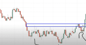
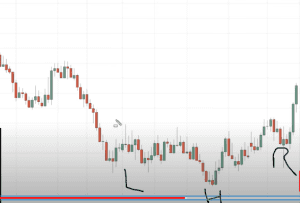
The first illustration we would be looking at is the inverse head and shoulder chart pattern, which is mainly a reversal pattern. Looking at the chart above, which is a daily timeframe, we can see that there is an inverse heads and shoulders pattern, identifying the left shoulder, the head, and the right shoulder, we also have the neckline indicating the rectangle.
One thing of note is that in other to know if the market is likely to reverse or not, you need to see where the reversal pattern has formed. Is it leaning against any higher timeframe structure?
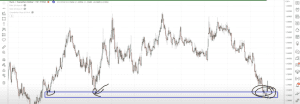 For example, from the chart above which is a weekly timeframe, we notice that the inverse heads and shoulders chart pattern found on the daily timeframe leans on the support zone on the weekly timeframe, we can also see that this support zone was tested thrice on the weekly timeframe in the forex chart above, which brings a better confluence and make the chart pattern reversal signal stronger.
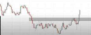
Let’s now look at how we can take our trades with very low risks. Going back to the daily timeframe, we highlight the neckline of the head and shoulder pattern, after highlighting the neckline, we can go further down to a lower timeframe like the 8-hour timeframe, and look for an entry position.
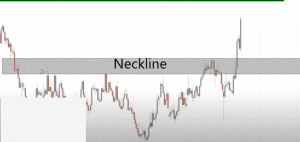 The chart above is the way our 8-hour timeframe looks after changing the timeframe to a lower timeframe from the daily timeframe. So our strategy here is to look for trading opportunities within the area of value, as that is where the heads and shoulders neckline is also located. Using the neckline as our resistance zone in this pattern, we will need to wait for price to break through the neckline/resistance zone.
Looking at the chart above we can see that price has broken above the neckline for the heads and shoulder chart pattern, and showed a bullish momentum. The question on your mind might be, how do we place our trade and get a good entry point so as not to miss out on this opportunity? But for professional traders, this breakout of the neckline/resistance zone is not the best time of entry.
The reason behind this statement is, many times traders jump into trades like this as soon as they spot a breakout afraid of missing out on the perfect opportunity, but if you do this, you will be disappointed at most times. In case you are asking why, in most cases, the breakouts often end up being false breakouts.
Therefore in this scenario, the best way to enter into this trade is to wait for the breakout and then the retest, so we call it the breakout and retest strategy. In this way, we are able to properly confirm that it is the best time to enter the trade for a buy. So what we do is to wait for price to retest the neckline zone, which was formerly a resistance zone but now a support zone, we must confirm that the neckline has been turned into a support zone before taking our trade.
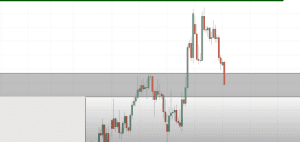 As we can see from the chart above, after the initial price breakout, price came back to retest the head and shoulder neckline, showing that the bulls have not taken charge completely, the next thing we need to do is to make sure to confirm if the neckline has become a support zone or if price will break through the neckline and start another bearish movement.
What we should be looking for is a reversal candlestick pattern or a rejection candlestick, it can be a doji, hammer, or engulfing candlestick, if we see that in the neckline zone, then it means the head and shoulder neckline is very likely a confirmed support zone and what we need to wait for is a price breakout above the recently newly formed resistance level, before taking our trade.
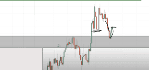
From the above chart we can see that price had broken through the recent resistance level, with a full body bullish candle, after seeing this, it means that we have a confirmation for a bullish movement.

So after confirming that the head and shoulder chart patterns neckline has turned into confirmed support, we need to establish our entry point, which will be the start of the next candle, our stop loss position, which will be a little bit below the neckline/support zone and our first take profit which will be the previous swing high as shown in the chart above.
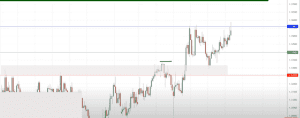
Looking at the chart now, we will see that price has hit our first take profit point, before showing a rejection as we placed our take profit point on the resistance level. Now if you are a trader who likes to trade and take out all your profit at the first take profit point, you can safely exit the market as soon as it smashes your first take profit point.
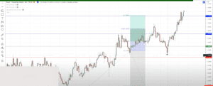
Some other traders will like more profit and decide to go further, I would advise that you take half your profit at the first take profit position before deciding to leave it till the next take profit point. Our next take profit position was placed at the next major resistance level.
In the above chart price eventually smashed our first take profit level and faced a massive rejection in the next minor resistance zone, which sent price falling almost to our stop loss point, before another bullish signal played out, which was what I mentioned earlier, that seeing these reversal candlestick signals indicate a strong reversal movement.
In the red circle, we can see the bullish engulfing pattern, this means the buyers have entered the market strongly and after this point, price moved all the way up to smash our second take profit position.
Hello Readers!!! Dipprofit Community is now on Threads, the new Twitter-like app, and we would like for you to follow us there, so we can also interact better and provide you with some educational tips and nuggets. Thanks for the follow!
Conclusion
In summary, taking trades using chart patterns must be carried out with other confirmations so as to not take rash trade decisions and lose all of our equity. This is why I decided to give this illustration in this article to give us an idea of what taking trades using chart patterns involves.
The strategy applied here is just one of many strategies that can be used by traders, but what is consistent among all traders is the fact that before jumping into any trade, using your strategy, confirmations are very important, depending on the way you have structured your trading strategy. For chart patterns, looking for confluence points will even give a better signal, and further help reduce the losses for you as a trader.
You can get this article in pdf format, click the button below to download the chart patterns pdf format.
«« Download PDF »»


